





 Oğuzhan Altun
7 min read
Oğuzhan Altun
7 min read
What is a dashboard? Marketing dashboards, KPIs and Looker Studio
What a dashboard is, how KPIs differ from metrics, the order for building one in Looker Studio, and how weekly marketing results are compared with the previous period.Pro
Contents 9 sections
A dashboard, originally a car’s instrument panel, is in business a visual reporting screen that gathers a company’s key measurements in one place so results can be tracked and compared together. We put the at the center of a marketing dashboard and use the other measurements to explain how it changes.
We start with the decision the dashboard supports. A weekly review needs more than every number on one page: we want to see what changed, in which channel, and for which outcome.
A marketing dashboard is built around KPIs tied to a business goal, and every indicator is read alongside the previous period.
What does dashboard mean?
Dashboard means an instrument panel or display board; context decides which screen it describes, from a car’s gauges to a software admin screen or a marketing report.
The word can point to three different needs:
- Someone wants the meaning of the word → we give the instrument-panel sense and identify how it is used in the sentence.
- Someone is looking for an admin screen → we point to the management area of the software or website in use, such as the WordPress Dashboard.
- Someone wants a reporting dashboard → we design a marketing dashboard by defining the business goal, the data sources, and the KPIs to track.
When a team asks us to “build a dashboard,” we settle this split first; reaching an admin screen and comparing marketing results are different needs.
What is a dashboard used for in business?
In business, a dashboard gathers key measurements on one screen to track results and evaluate change between periods. In marketing, it lets us read the target outcome alongside channel performance.
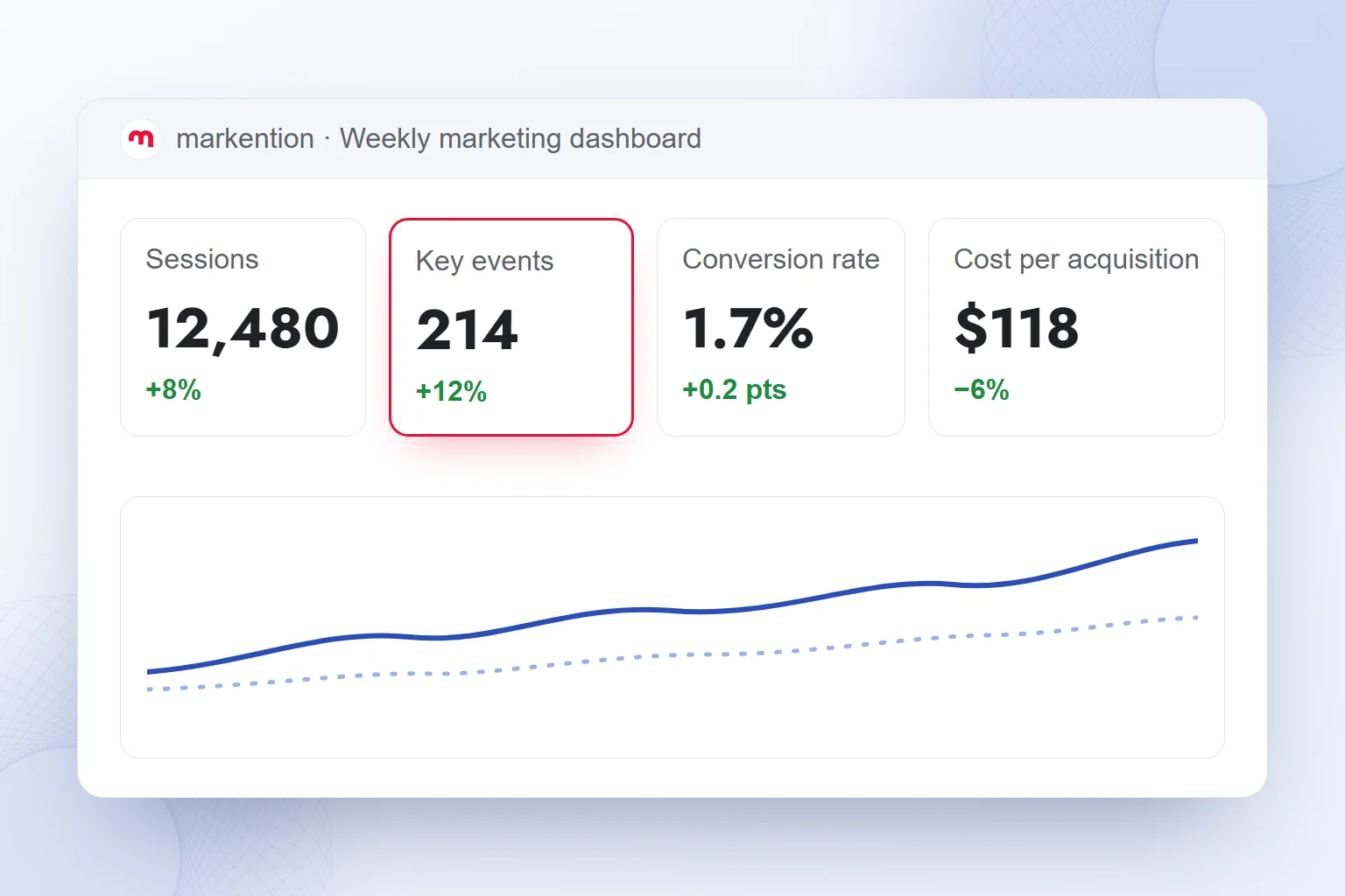
We place three to five KPI cards in the top row, each with the previous-period comparison beneath it, a trend chart below, and a channel or campaign breakdown at the bottom. Date and channel filters show which period and traffic we are examining.
Cards show the total, the trend chart shows movement over time, and the table shows the split by channel or campaign. We read in that order: when one card rises, the related trend and channel rows tell us where to look next.
We also name an owner from the start, who keeps track of definitions and the comparison period, so the team acts on results instead of decoding numbers.
What is a KPI, and how does it differ from a metric?
A KPI (key performance indicator) is one of the few measurements we select for a business goal; a metric is any value we measure. Every KPI is a metric, but not every metric is a KPI.
Sessions and clicks are metrics; they become KPIs only when their link to the goal is clear. Our test: when this value changes, which business outcome will we evaluate? A measurement that fails it stays out of the top row.
In GA4, the equivalent of a conversion is a “.” If the dashboard says “conversion,” we define which event we mean; otherwise the team reads the same number differently. In our Google Analytics 4 work, we settle this definition before the layout.
| KPI | What it answers | Comparison |
|---|---|---|
| Key events | How often did our target event occur? | Its count in the previous period |
| Conversion rate | How did our goal’s completion rate change? | Previous rate, same definition |
| Cost per acquisition | How did the cost of our chosen acquisition change? | Previous cost, same definition |
| Organic clicks | How did organic search clicks change? | Previous clicks, same scope |
We select the ones that fit our goal; a dashboard tracking organic clicks has different priorities from one evaluating acquisition cost. Each card’s name, source, and comparison period are written down together.
How do we build a marketing dashboard?
We build a marketing dashboard by defining the business question, selecting KPIs, documenting sources, and setting up the period comparison. The layout follows the team’s decision.
- We define the question and ownerWe write the one business question it answers and choose who follows the weekly review.
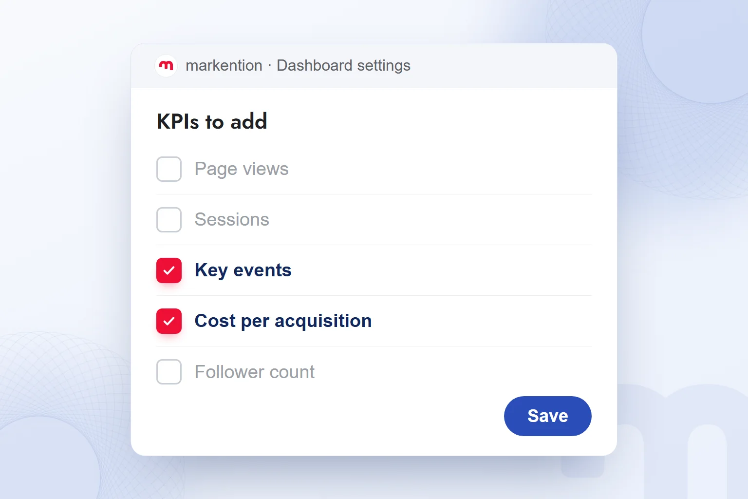
- We select the KPIsWe pick three to five indicators tied to the goal and explain what each measures.
- We document the sourcesWe record each indicator’s source and which event “conversion” refers to.
- We set up the comparisonWe choose the date range, show the previous period on every card, and keep the scope equal.
- We arrange the dashboardCards at the top, the trend chart below, the channel or campaign table at the bottom, plus date and channel filters.
- We plan the reviewWe share the report, schedule delivery, and decide who reviews the results.
The comparison is not an afterthought. If one card covers all channels and another a single campaign, we make that visible, and we keep each indicator’s definition and scope unchanged across periods.
For the channel breakdown, UTM and other parameters matter; our article on URL parameters covers this. We check which definition each channel name on the dashboard rests on.
How do we create a dashboard in Looker Studio?
We create a dashboard in Looker Studio by connecting a data source to the report and adding KPI cards, a trend chart, and a breakdown table. Looker Studio is Google’s free reporting tool, formerly called Google Data Studio.
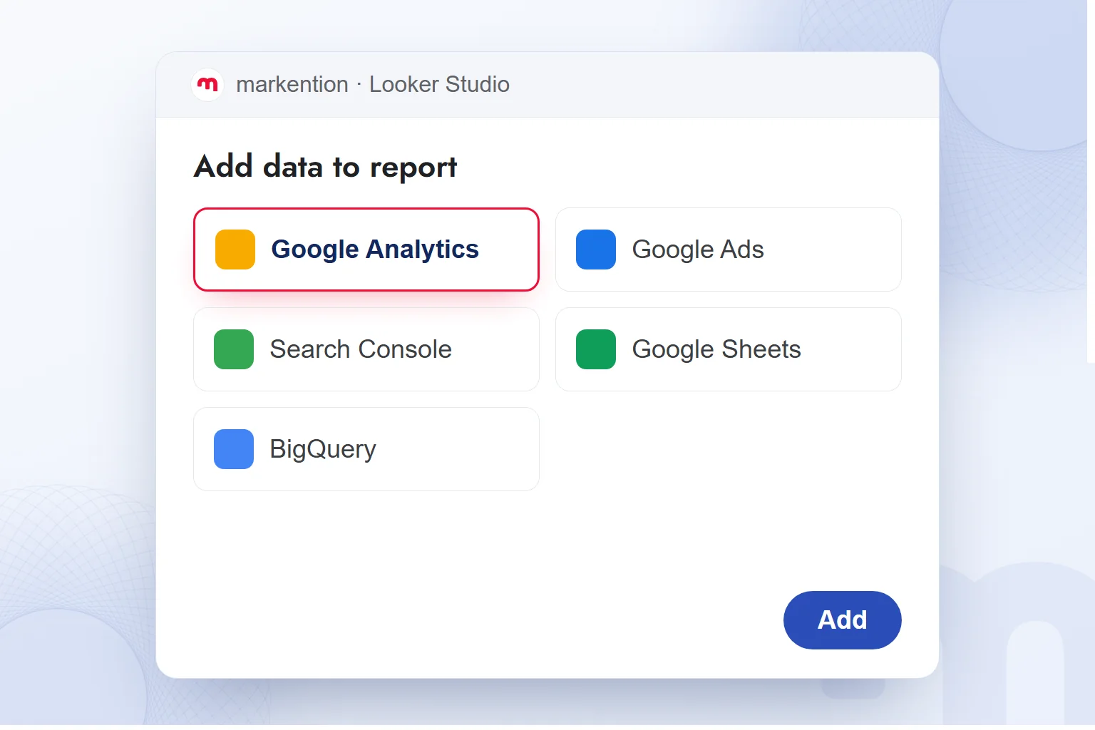
When adding data, we choose the that fits the source. We use GA4 data through Google Analytics, along with sources such as Google Ads, Search Console, Google Sheets, and BigQuery. We first map each indicator to its source, then connect.
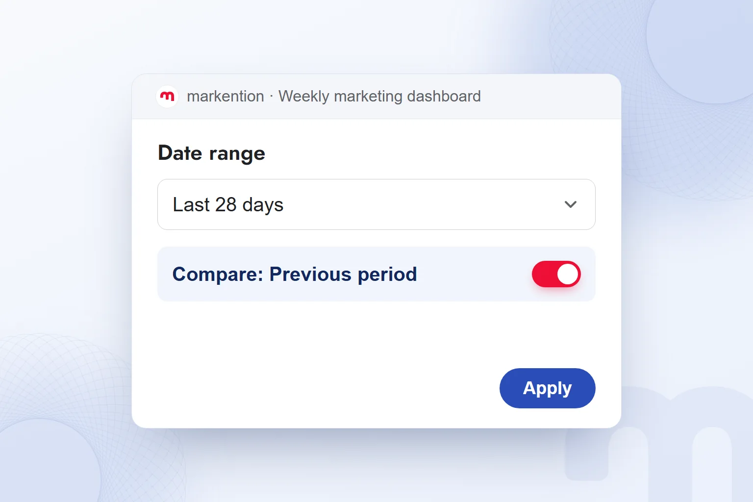
Next we edit card names and the date range, add the previous-period comparison, and check that the key event in the source and the card describe the same outcome.
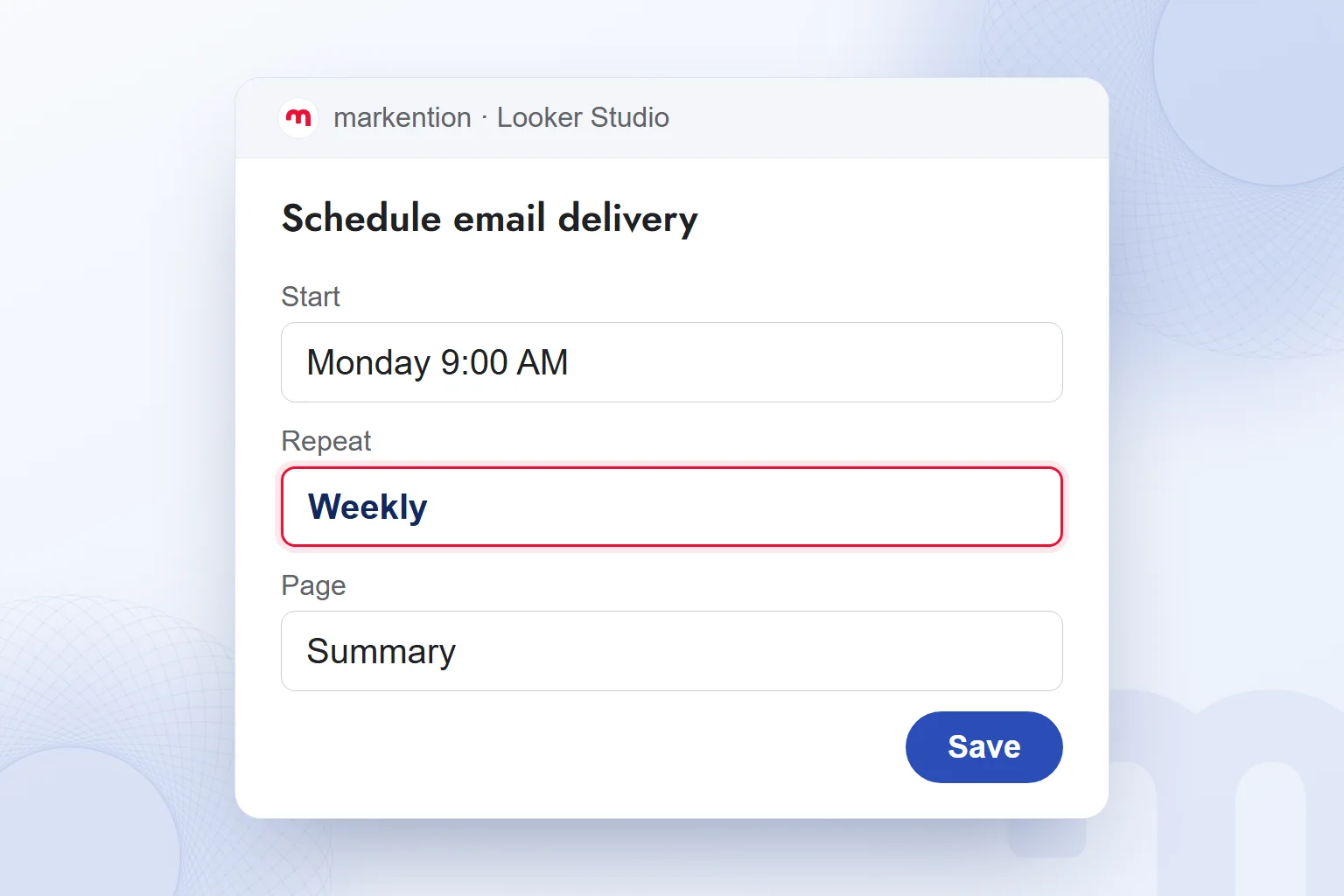
We share the report by link and schedule email delivery. In our Looker Studio reporting work, data connection, indicator definitions, and regular review are set up together, so every report has a clear question and owner.
How do we choose between Power BI, Excel and Looker Studio?
We choose between Power BI, Excel and Looker Studio based on our data sources and the team that will use the dashboard.
Power BI is Microsoft’s business intelligence and reporting tool; with it too, we first write down the data, the team’s workflow, and the decision it supports. A dashboard can also be built in Excel; “excel dashboard” describes that use. Looker Studio, with connectors, link sharing, and scheduled email delivery, is among our options for marketing reports.
We decide from the same list of needs: where is the data, who defines the indicators, who follows the report? Whatever the tool, KPI definitions and the previous-period comparison stay the same.
How do we adapt dashboard examples to a weekly marketing dashboard?
We adapt dashboard examples by inserting our own business question and KPI definitions. At markention we follow Oğuzhan’s weekly dashboard approach: the top row holds at most five cards, each with the previous-period comparison beneath it.
In a typical review we read sessions, key events, conversion rate, and cost per acquisition together: first the change in our target event, then its spread across the period on the trend chart, then which channel rows changed.
This order takes us from the total to the channel worth investigating. A rise in key events and a rise in acquisition cost are interpreted separately, and the review ends with the channel or campaign to examine again.
For weekly tracking, we schedule email delivery in Looker Studio: we tie the summary page to Monday morning and make clear that the recipient owns the report.
How do we fix common dashboard mistakes?
We fix dashboard mistakes by reducing indicators, clarifying definitions, and naming a report owner, after establishing whether the problem lies in usage, data, or indicator choice.
The three situations we meet most often, and our response to each:
- Nobody looks at the dashboard → we set a single question and a single owner, and email the report on a schedule.
- The numbers don’t add up → we write down indicator definitions and data sources, and check the compared period and channel scope.
- There are too many cards → we cut the KPIs to five at most and redefine which business outcome each card evaluates.
A vanity metric is a measurement whose increase does not explain a business outcome, such as page views or follower count presented alone as success. We judge a measurement by its link to the goal. We build the return card on an advertising dashboard with the calculation in what is ROAS, and add on-page behavior from Microsoft Clarity recordings. More on measurement and reporting is on our English blog.
Frequently asked questions
What does dashboard mean?
Dashboard means an instrument panel or display board. In business, it is a reporting screen that gathers key measurements in one place.
What is the difference between a KPI and a metric?
A metric is any measured value; a KPI is a key performance indicator selected for a business goal. Every KPI is a metric, but not every metric is a KPI.
How many KPIs should a marketing dashboard have?
We use three to five KPIs in the top row. Each card shows the previous-period comparison, and the selection follows the business goal.
Is Looker Studio free, and is it the same as Google Data Studio?
Looker Studio is Google’s free reporting tool; its former name is Google Data Studio. Data sources are added to reports through connectors.
Can you build a dashboard in Excel?
Yes. We choose between Excel, Power BI and Looker Studio based on our data sources and how the team works.
Can a Looker Studio report be emailed on a schedule?
Yes, Looker Studio can email a report on a regular schedule. For weekly reviews we set the schedule and the report owner together.

 How to do a competitor analysis: stages and an action planRead article
 What is Microsoft Clarity? Heatmaps and session recordings explainedRead article
 What is segmentation? Market segmentation types and GA4 audiencesRead articleMost read
 What are URL parameters? UTM, GA4 event parameters and gclidRead article
 AI photo editing: remove backgrounds, sharpen and expand photosRead article
 What is Microsoft Copilot? How it works and how to get citedRead article
 Advertising on ChatGPT: Ads Manager, Targeting and Your First CampaignRead article
 What is Shopify? Using it in Turkey, how fees work and vs WooCommerceRead article
Questions & answers
0 commentsNo questions yet; you can ask the first one.