




 Cihat Murat Yüksel
8 min read
Cihat Murat Yüksel
8 min read
What is a user interface (UI)? Meaning, examples and UX difference
A user interface is the arranged screen through which people work with a website or app: menus, buttons and form fields. What UI means, how it differs from UX, and how it is tested.Pro
Contents 9 sections
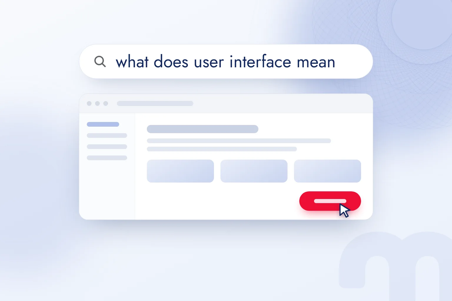
A user interface is the arranged screen on a website or app that lets a person interact with software through menus, buttons and form fields, and helps them complete the task they came for. It is shortened to .
When we assess a screen, we consider where the user will look, which action they will choose and what they will see next. On a quote form, how the fields look and how it feels to complete the form are reviewed separately: a readable button is an interface question, the steps to send a request are part of the experience.
An interface is judged by its visible elements and by whether the task gets done; design decisions are tested against real user behavior.
What does user interface mean?
A user interface is the arranged screen that lets a person interact with software. In computing, “interface” names this point of interaction between software and its user. On its own, interface means a meeting point between two systems; user interface narrows it to where a person meets the software.
Opening a services menu, typing into a quote form and pressing send all happen through the interface; so does choosing a section in an app and reading the message that follows. We treat the screen as the place where the user talks to the software.
An interface covers layout as well as visible text. Form title, field labels, button position and result message work together, so we design them as one task: the user should understand what to do and see the result.
What is UI?
UI is the set of menus, buttons, form fields, typefaces, colors, icons, spacing and feedback messages a user sees and interacts with. UI is short for User Interface. Each element is defined by its job on the screen.
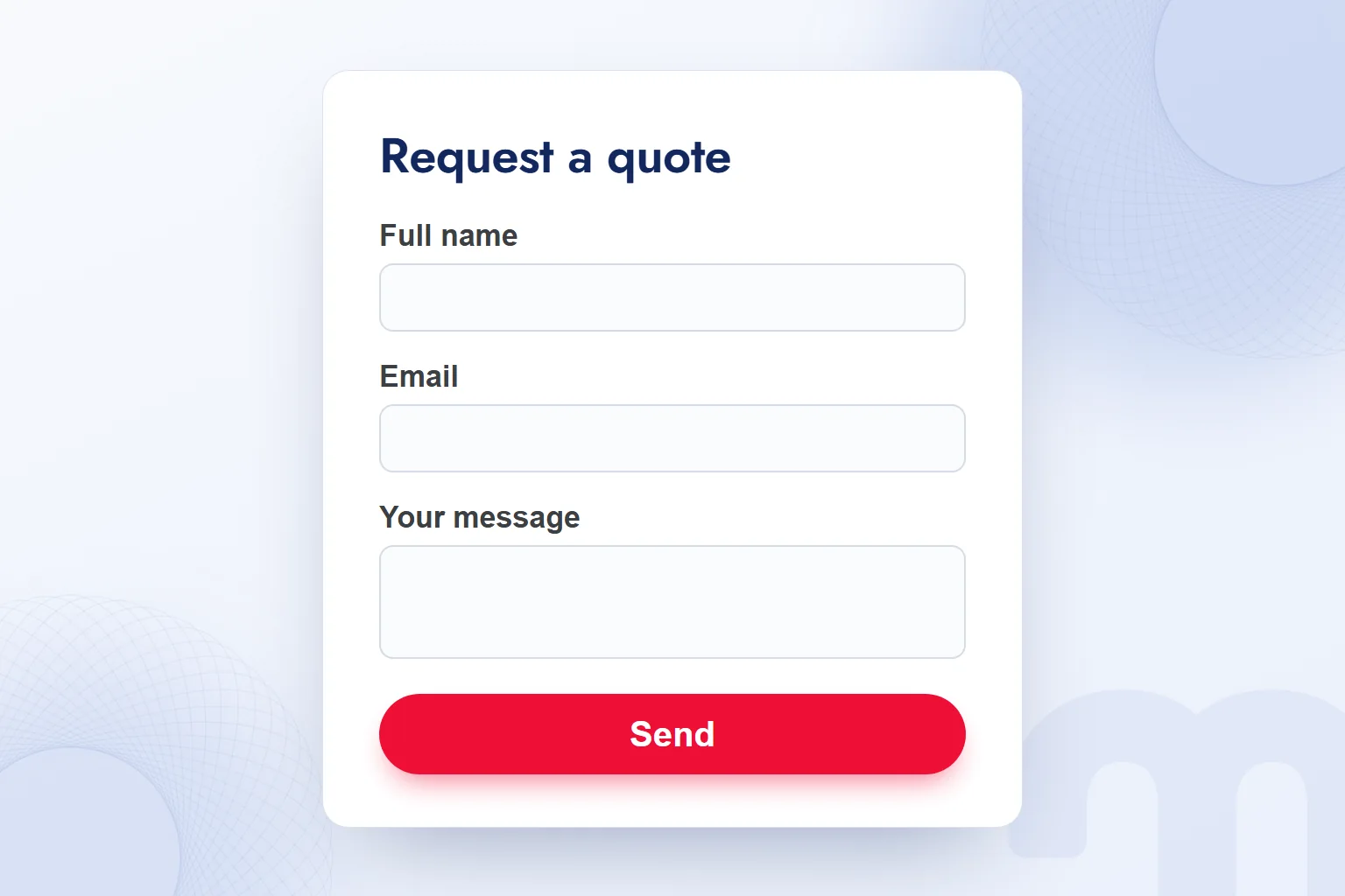
On a quote form, the title tells the user which action they are taking. The labels “Full name”, “Email” and “Your message” show the expected information. The “Send” button carries the primary action. We set up how fields, labels and the button relate, and check how the user will read the form.
Spacing, typeface and color belong to this layout too. We review title and label hierarchy, the room around the button and message readability, including error text. Interface work covers the starting view and every state met during the task.
What is UX?
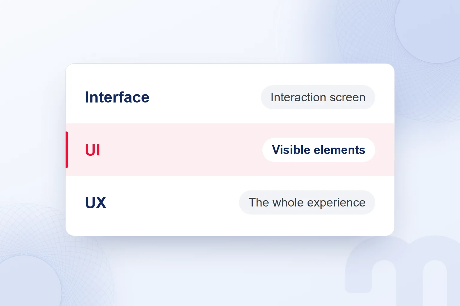
UX is user experience: the perceptions and responses that come from using, or anticipating the use of, a product, system or service. The definition from also includes expectations before use.
Need, flow, findability, speed, accessibility and support are assessed together. We look at where a person requesting a quote finds service information, how they reach the form and how they finish; the form is the interaction area inside this experience.
In UX design we study the user’s goal and the path to it: interviews show needs, usability tests show how a task is carried out, and support requests show where help was needed.
Each research finding becomes a concrete design question: where did the person abandon the form, and how does that question relate to their need? The next change is based on the answer.
What is the difference between UI and UX?
UI covers the elements on the screen and their visual language; UX covers the whole experience, from the need to the finished task. UI is the visible part of UX. A button’s color and label are UI decisions; how many steps a form takes and why people abandon it are UX questions.
| Topic | UI | UX |
|---|---|---|
| Focus | Screen elements and visual language | User needs and the whole experience |
| Question it asks | Is the button seen and understood? | Where and why does the user abandon the task? |
| Output | Layout, look and messages of elements | User flow and research findings |
| Measurement | Readability, contrast and interaction with elements | Task completion, drop-off points and feedback |
| Example decision | Setting the button’s color and label | Reordering the steps and questions in a form |
| Owner | UI designer | UX designer or researcher |
We split the work along these questions. When one person holds both roles in a small team, we still ask separate questions about look and flow.
In a form review the two feed each other: if the user misses the button, we examine its look and position; if they reach it but do not finish, we examine the flow.
How do you design a good user interface?
We design a good interface by defining the user’s task, building the flow and testing the screen with real users. Visual decisions follow from that task.
- We write down the user’s taskWe define a concrete task, such as requesting a quote, and the result the user wants.
- We map the flow step by stepWe list the screens and questions the user meets from the starting point to the finished task.
- We set the elements and the primary buttonWe place the menu, fields and messages, and make clear which button holds the main action.
- We check contrast and readabilityWe compare text with its background and check that labels and feedback messages can be read.
- We test with real usersWe give the user the task and watch where they stop, what they choose and how they finish.
- We measure and fix after launchWe review drop-off points, session recordings and support requests, and revisit the problem step.
When we redesigned our own site, markention.com, we set these rules. We never place a second box inside a framed surface. We use red in every section, but only for a selected or winning state. We choose flat, calm colors over glossy, metallic or three-dimensional surfaces. We create depth through texture and slow motion.
Using red only for the selected state guides the eye to the primary action. In user tests, we watch whether the person finds the target element and completes the task.
Why does accessibility matter in an interface?
Accessibility directly affects whether the user can read the text, tell elements apart and continue their task. We assess color, type and button decisions with this need in mind.
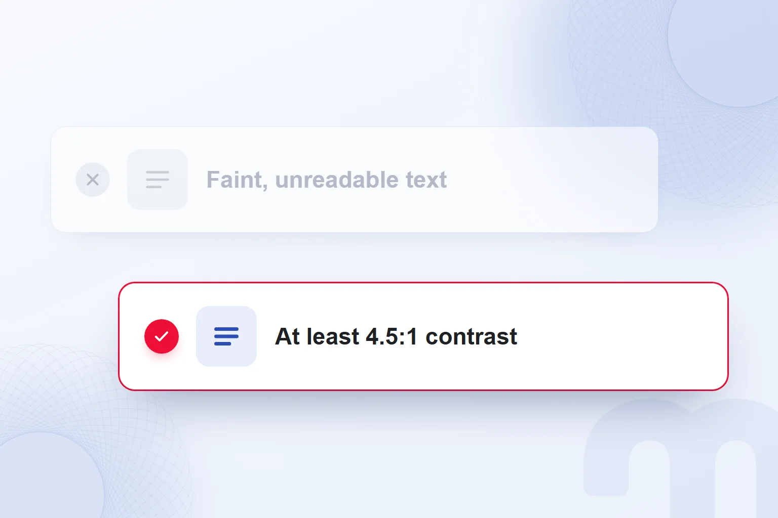
The minimum contrast criterion at level AA of is based on the ratio between text and background. We check titles, field labels and feedback messages on their own backgrounds, and never apply the large-text ratio to normal-size text.
An error message must be both clear and readable: we check its wording, font size and background, and on mobile the button’s tap area and text size. When the same page looks different across browsers, we also run browser checks.
We carry the readability review through every state of the form, assessing each color on the surface it sits on.
How do you diagnose an interface problem?
We diagnose an interface problem by giving a real user a task and watching which element or step stops them. That behavior shows which area to examine.
Each case has its own answer:
- The user does not see the button or clicks the wrong place → On the UI side, we check position, contrast, size and label.
- The user understands the steps but does not finish → On the UX side, we look at the flow, step count and unexpected questions.
- The user cannot find what they are looking for → We review the information architecture and menu structure.
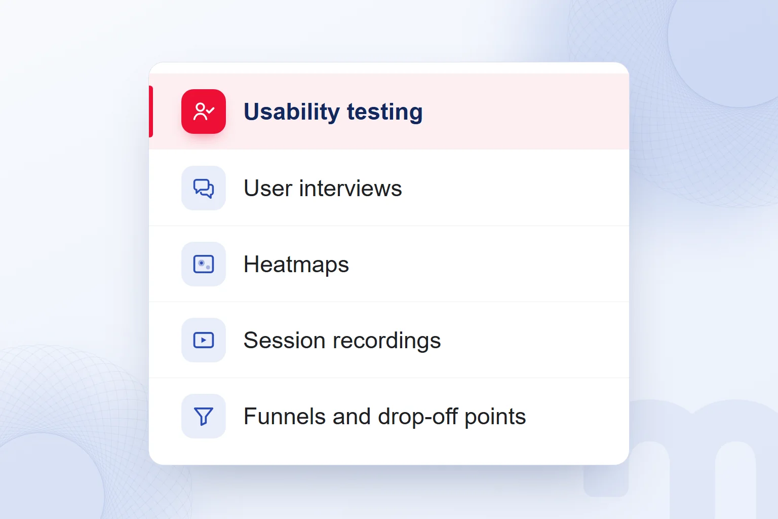
Usability tests show progress; interviews show how users explain where they got stuck. When we review heatmaps and session recordings, we track which elements users move toward and where they stop.
In analytics we review funnels and drop-off points; in support requests, the topics people need help with. We group findings around one task, such as reaching, filling in and sending the quote form, then decide which element to fix.
How do you measure the impact of an interface change?
We measure the impact of an interface change by comparing how users complete the same task, where they stop and where they leave, before and after the change. The task is defined before the change.
Common situations and our response to each:
| Situation | What we do |
|---|---|
| Drop-off did not decrease | We watch session recordings to see where users get stuck. |
| Clicks rose but conversions did not | We check whether the next step keeps the promise of the previous screen. |
| The problem appears on mobile, not desktop | We test tap area and font size on mobile. |
If we changed the quote form’s button, we track button interaction and form completion together; once we find the step users abandon, the next change goes there.
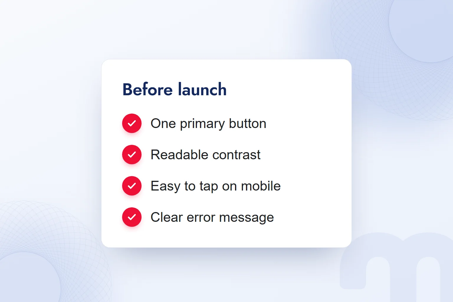
In our UX/UI design service, screen decisions are handled with user needs, flow and measurement. Before launch we check for one primary button, readable contrast, a usable tap area on mobile and a clear error message; after launch we watch the same task again and fix what the findings show. We cover shipping one interface on iOS and Android in what is Flutter, layers that open over a page in what is a pop-up, and print versus screen color codes in what is Pantone. More on page structure and usability checks is in our blog.
Frequently asked questions
What does user interface mean?
A user interface is the arranged screen that lets a person interact with software. The menus, form fields and buttons on a website are parts of it.
What does UI stand for?
UI stands for User Interface. It covers the screen elements a user sees and interacts with.
What is UX?
UX is user experience: the perceptions and responses from using, or anticipating the use of, a product, system or service. Need, flow, accessibility and support are part of it.
What is the difference between UI and UX?
UI focuses on screen elements and visual language; UX on the whole experience. A button’s color is a UI decision; why a form is abandoned is a UX question.
How can you tell if an interface is good?
Users find the elements, read the text and complete their task. We check this by giving real users a task and watching their progress.
Who is responsible for interface design?
A UI designer handles screen elements and visual language; a UX designer or researcher studies needs and flow. In small teams, both roles are sometimes held by the same person.

 What is Git? Git vs GitHub and version control for marketersRead article
 What is Flutter? When to choose it for a mobile app, and its limitsRead article
 What is Shopify? Using it in Turkey, how fees work and vs WooCommerceRead article
 What is a browser? Browser examples and setting a default browserRead article
 What is a URL? Parts of a web address, slugs and their role in SEORead article
 What is a PDF? Uses, and PDFs on your website: indexing and trackingRead article
 AI photo editing: remove backgrounds, sharpen and expand photosRead article
 What is Microsoft Copilot? How it works and how to get citedRead article
Questions & answers
0 commentsNo questions yet; you can ask the first one.