



 Cihat Murat Yüksel
13 min read
Contents 13 sections
Key takeaways
- A call to action, or CTA, is a short message telling visitors what action to take and how.
- W3C WCAG 2.2 criterion 2.5.8 Target Size requires pointer targets of at least 24 by 24 CSS pixels.
- According to the Meta Business Help Center, ad CTA buttons come from a fixed list in Ads Manager.
- Google Ads Help says both the desired action and the way to complete it should be obvious.
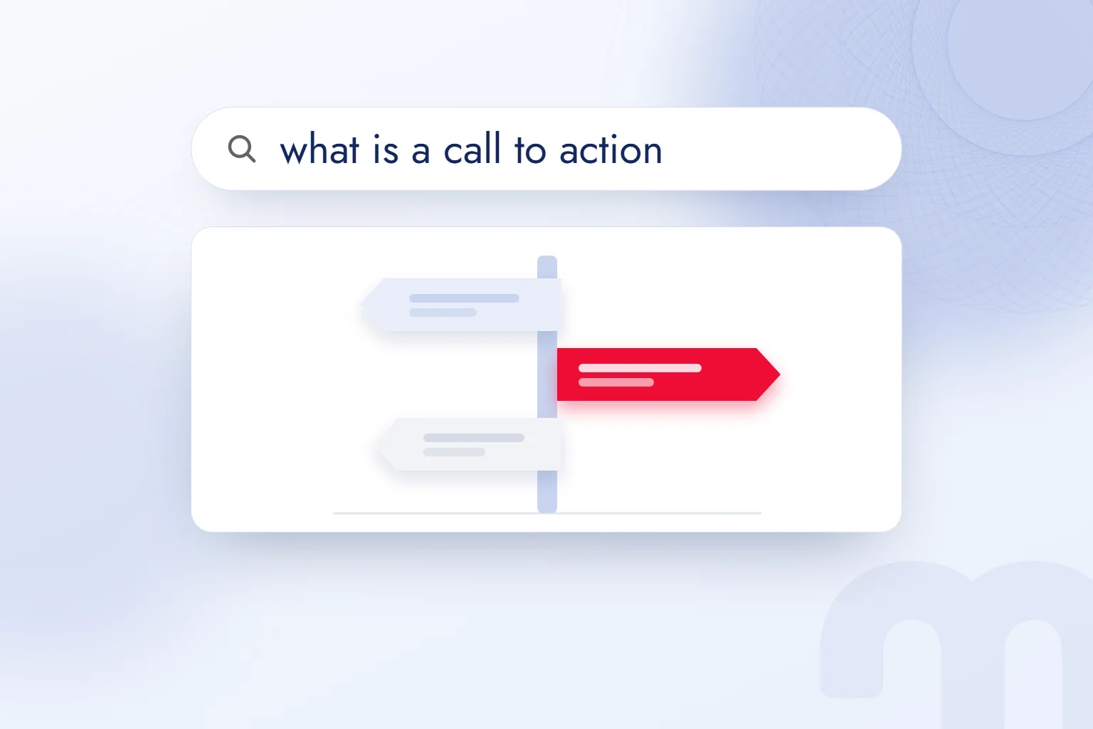
A call to action (CTA) is a short message that tells visitors exactly what we want them to do on a page and how to do it; it usually appears as or link text.
Before writing a CTA, we set the page’s main action: if we want a quote request, the button links to the quote form and says so. We check the button words, the text around them and the page that opens together.
Each page is given one main action, and the button says plainly what will happen next.
What is a call to action (CTA)?
A call to action is a message that tells visitors which action to take and how to take it. CTA is short for “call to action.” Google Ads Help defines the concept around clarity: the desired action and the way to complete it should both be obvious.
Google Ads Help gives two examples: a “Buy now” button that leads to a transaction page, and a “Call now” message next to a prominent phone number. The button moves people to the transaction; the message says what to do with the number.
Clarity is the core test. We never judge a CTA by its words alone; we check whether the button, link or phone number it points to actually starts that action.
What does CTA stand for, and where do you see it?
CTA stands for call to action, and it appears on buttons, links, next to phone numbers, in forms, in ads and in emails. We fit the format to the space and keep the action clear each time. A link can do the same job as a button.
Google’s “Learn more” link example gives quick access to extra information. When we place such a link, the surrounding text must make clear what the information is about.
A form button describes sending the details entered. In an ad, the chosen call is compared with the landing page; in an email, the text before the link and the destination must share a topic.
If a workshop’s email offers a catalog, the link text is about the catalog. When its contact area asks people to phone, the call changes. The business is the same, but the expected action differs, so one CTA does not travel to every space.
Where else is the abbreviation CTA used?
CTA also stands for different terms in medicine and finance; we read its meaning from the field and the context.
CTAs in email and video
In email, we pick one main button; in video, we tie the spoken call and the description link to the same action. If an email covers a guide, the button names the guide or its topic: instead of a vague “Continue,” we consider “Read the sizing guide.”
Say a workshop’s product care email has “Read the care guide” as its main button. The line above it says which care tasks the guide covers, and the link goes to that guide. Catalog and quote calls do not sit beside it with equal weight.
For email links, we also follow the WCAG link purpose principle: readers should understand where a link leads from its text or context. When a button must be shorter, we cut filler words and keep the content’s name.
If a YouTube video covers the same guide, the spoken call is “Open the guide in the description for the care steps,” and the description link reads “Read the care guide.” In the final check, we open that link and confirm it reaches the right version of the guide.
What makes good CTA text?
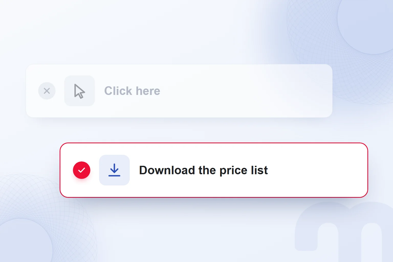
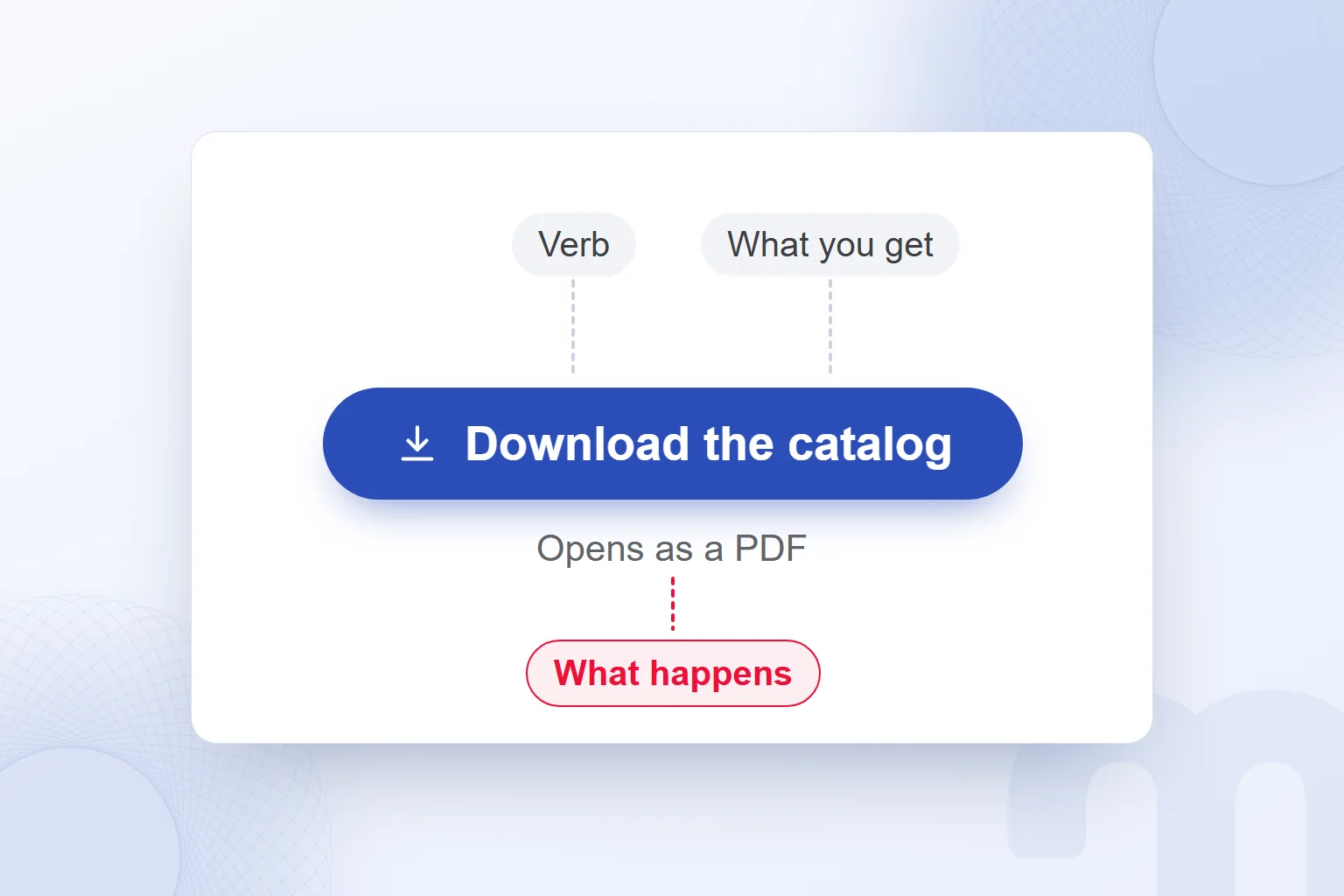
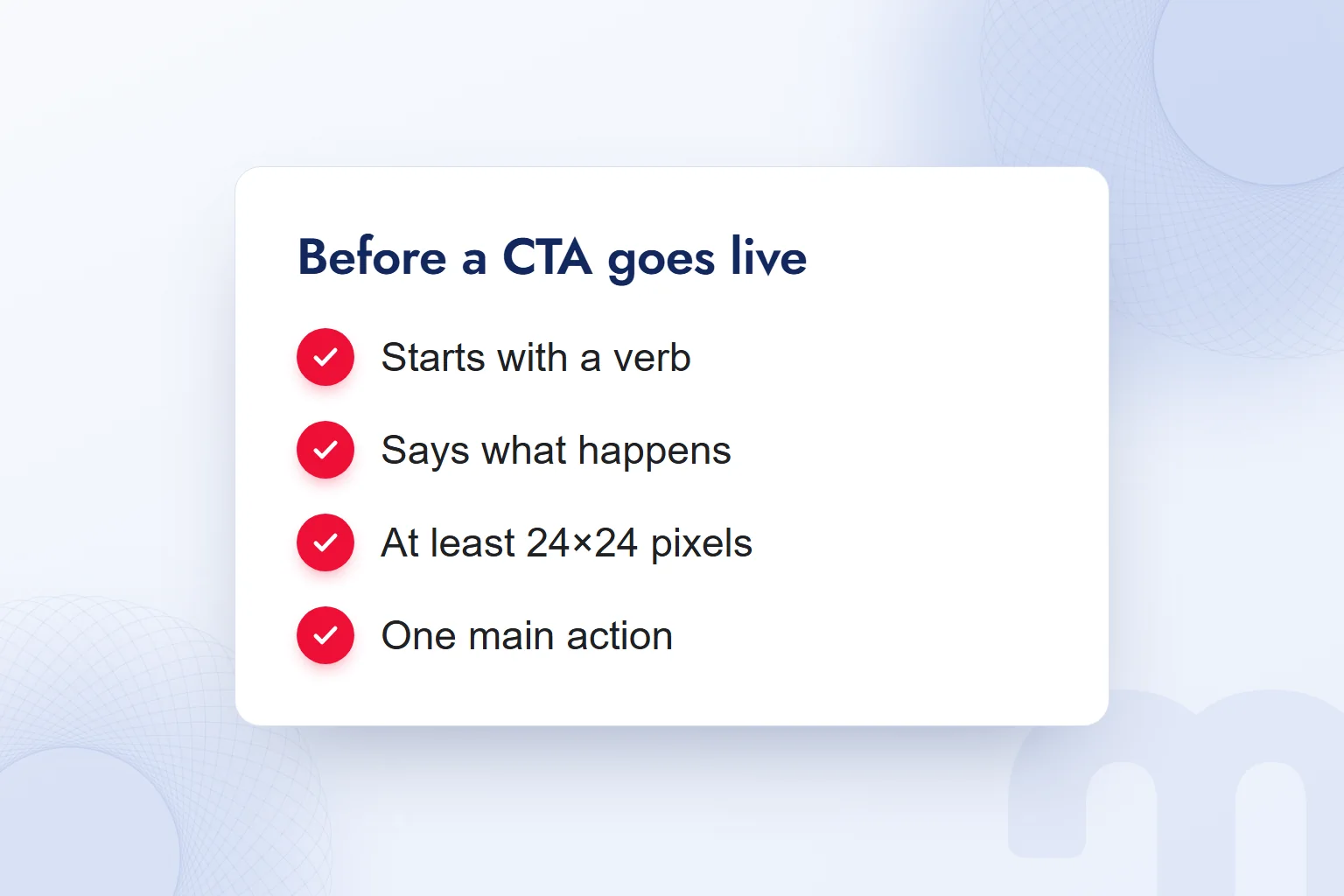
Good CTA text starts with a verb, says what will happen and supports the page’s one main action. Even short text carries the action. “Download the price list” instead of “Click here” states both what the reader gets and what they do.
W3C WCAG 2.2 success criterion 2.4.4 Link Purpose requires that a link’s purpose can be understood from its text alone or from its text together with its context. Cases where the purpose would be ambiguous to everyone are excluded. In our writing, we prefer links that explain themselves.
The buttons on our own homepage start with a verb and say what will happen: “Let’s talk,” “Book a call,” “Send the report link.”
To choose one main action, we write down what we expect from visitors at the end of the page. If it is a quote request, information links stay secondary.
How do you write CTA text?
We write CTA text by choosing the page’s main action, picking the verb and the thing the reader gets, explaining the next step and testing it once live. Before shortening the text, we check it still matches the destination.
- We set the page’s one main actionWe decide whether the visitor should request a quote, read a guide or call, and state the button’s job plainly.
- We start with a verbWe pick the verb that names the action, such as “read,” “download” or “call,” and build the text around it.
- We say what the reader getsWe name something concrete, such as a catalog, a price list or a guide.
- We say what happens next to the buttonWhen the way a file opens needs explaining, we add a short note such as “Opens as a PDF.”
- We avoid clashes with other linksWe keep supporting links apart from the main action and never give different actions equal weight in one space.
- We test after launchWe run a single-variable test and compare clicks and the follow-up action with the same measurement.
We build the text around a CTA on the link between purpose and promise covered in our copywriting guide. The button does not carry the whole explanation: the action goes on the button, the extra information next to it.
For a furniture workshop’s catalog, we draft “Download the catalog,” then open the destination and confirm it reaches the catalog. If the button opens a form first, the nearby text says so.
How do you use a CTA in ads?
In ads, the ad’s goal, the chosen button and the landing page must all describe the same action. We first set the step we expect, then write the ad copy around it. If a headline invites people to review product details but the button leads to a quote form, the description explains that transition.
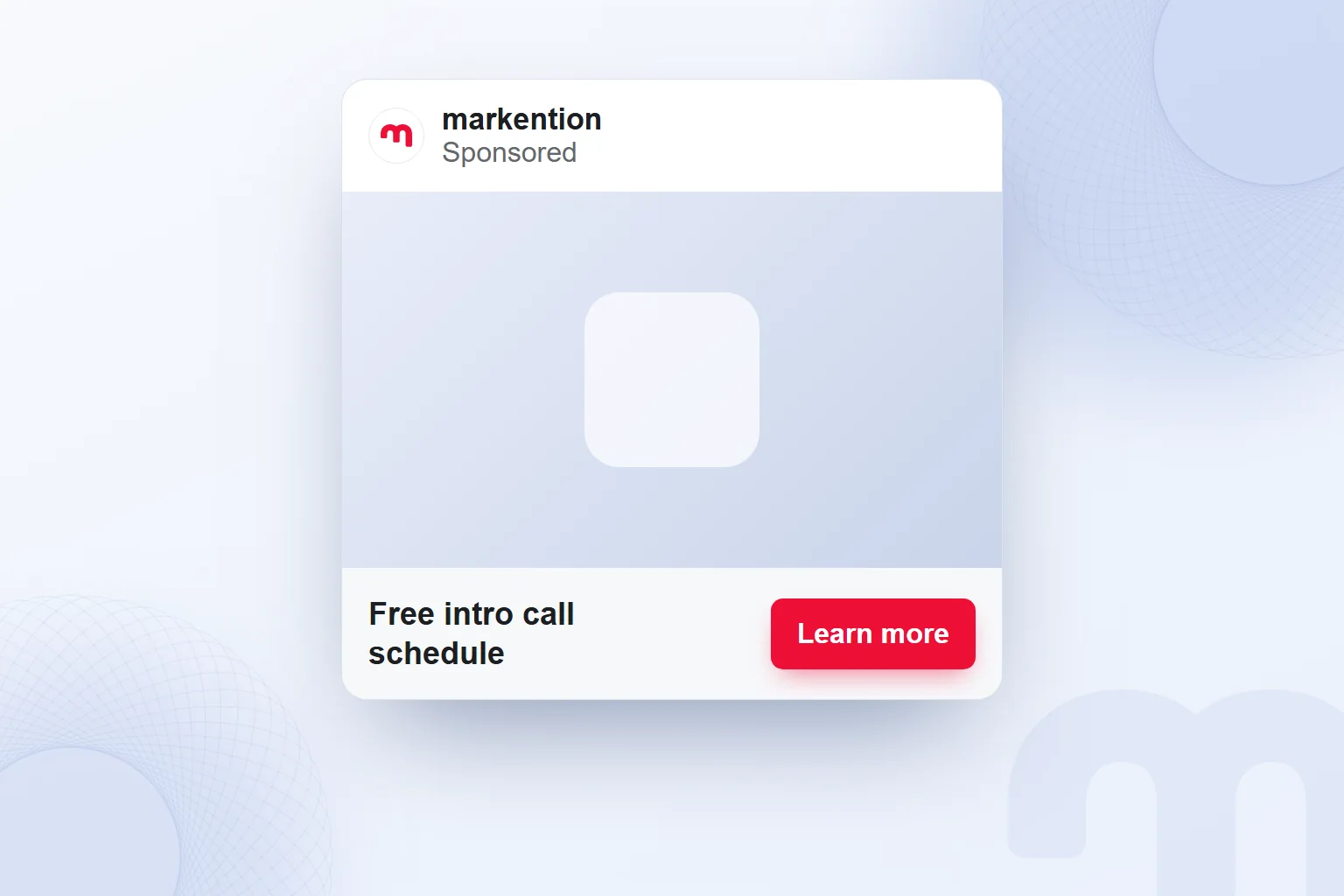
According to the Meta Business Help Center, the call-to-action button is chosen from a fixed list in Ads Manager, such as “Learn more,” “Shop now” or “Sign up.” The options shown vary with the ad’s objective and placement, so we check what is offered for each ad rather than treating the examples as a fixed list.
Button text cannot be written freely. The detail goes into the ad copy, which completes the chosen button. If the button is “Learn more,” the headline and description say what there is to learn about.
Say an intro call ad has the headline “Free intro call schedule” and the button “Learn more.” The description states the call’s topic and what the landing page contains. We use “free” only for a call that really is free.
If the button goes to an information page, the copy reads “Review the call’s scope and schedule.” If it goes straight to a sign-up form, we mention the form step and look among the offered buttons for one that describes it. We decide by where the click actually leads, not by which phrase sounds stronger.
Google Ads Help’s “Buy now” and “Call now” examples are not the same list as Meta’s buttons, but the standard is shared: the message states the action clearly.
In Meta Ads consulting work, we assess the ad copy, the selectable button and the landing page together. Before launch, we read the headline, description and button in order: do all three describe the same next step?
How do you write a CTA for Instagram and social media?
On Instagram and social media, we write the CTA by naming one action in the first line of the caption. The post’s topic gives the reason; the call says where and what the reader will do. We choose saving, opening the profile link or commenting according to the post’s purpose, never all of them in one sentence.
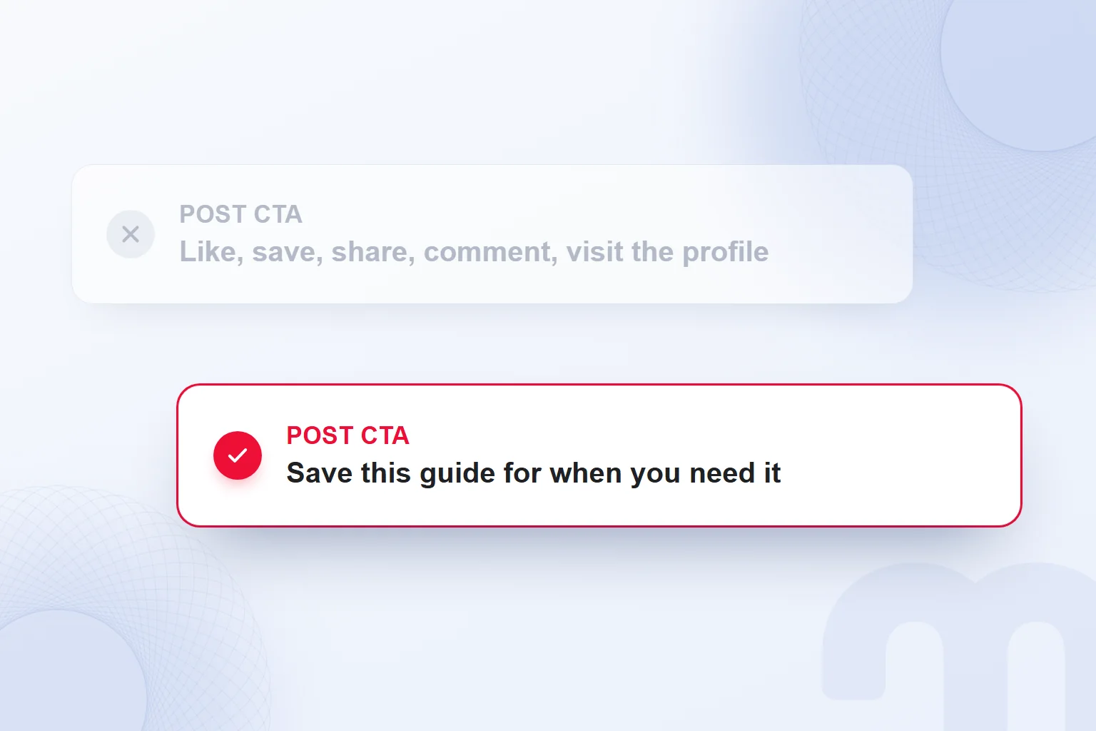
We first describe how the post will be used. For a care guide that readers should return to, we write “Save this guide for when you need it.” To send people to detailed content on the site, we consider “Open the link in our profile for the care guide,” after checking that the profile link really leads there.
We choose the call according to the action we expect from the post:
- Goal: saves → “Save this guide for when you need it,” clearly naming the content to be used later.
- Goal: site traffic → “Open the link in our profile for the sizing guide,” after checking the page the link leads to.
- Goal: comments → “Tell us in the comments which step was hardest when measuring,” keeping the answer tied to the post’s topic.
These are not sentences to stack at the end of one post; we pick the one that matches the goal. If a guide we want saved also ends with “Visit the site, browse the product, call us,” we simplify the draft. The test: after reading, can the reader name the single step being asked of them?
We also make comment questions specific. In a post about taking measurements, “Which measurement do you find hardest to take?” works better than “What do you think?” The first asks about the method shown; the second leaves the topic open.
If there is a brand partnership, the post discloses it clearly. A CTA does not replace that disclosure; “Open the link in our profile” is a separate job from declaring the partnership. We handle disclosure with the framework in What is an influencer? and keep the call consistent with it.
In the final read, we compare the cue in the post’s image with the caption’s first line; if one asks for a save and the other for something else, we align them. We never move a call to another post without checking its destination.
How do you design a CTA button?
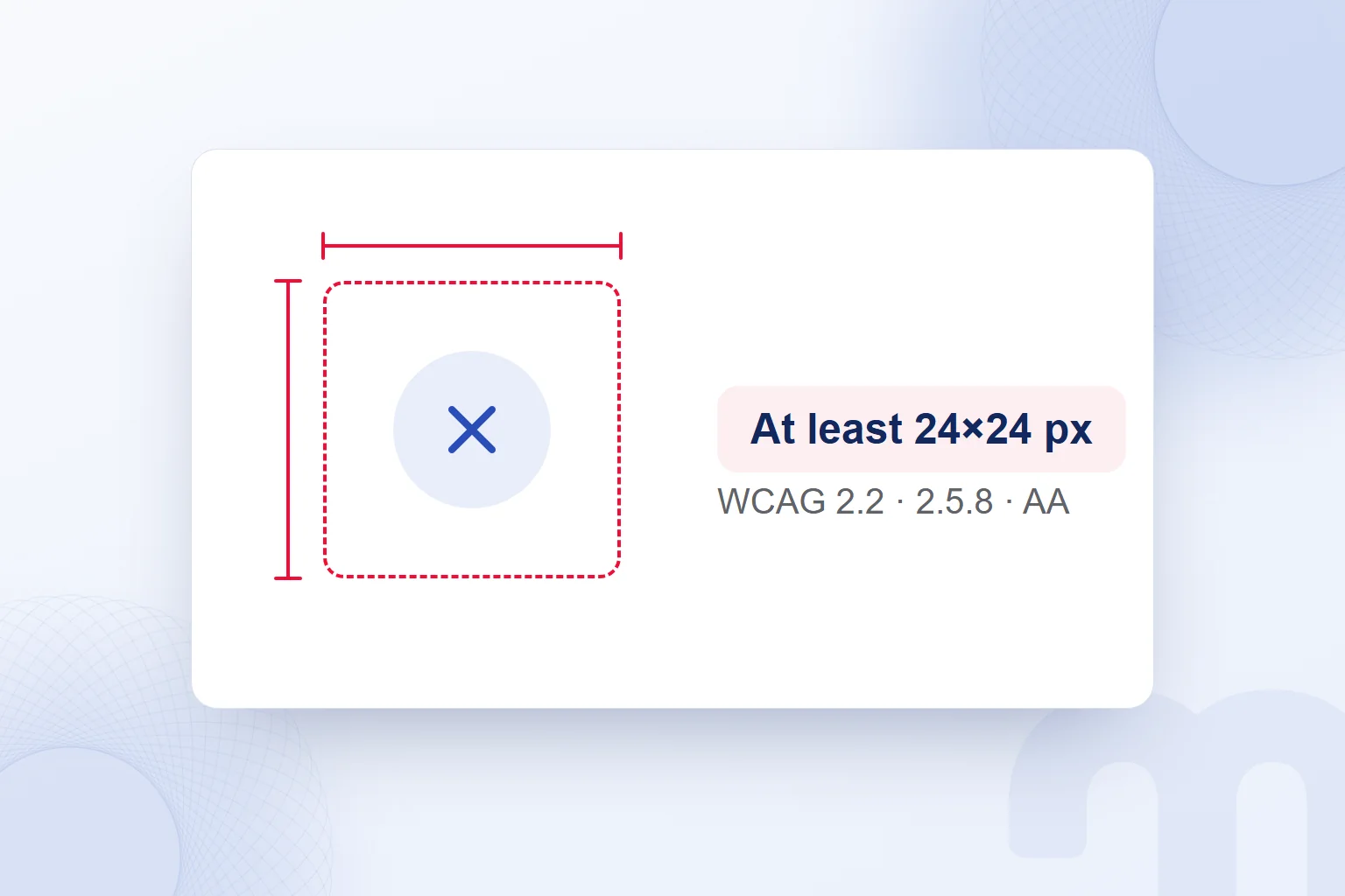
We design a CTA button to be visible, clear in function and large enough for the WCAG size criterion. W3C WCAG 2.2 success criterion 2.5.8 Target Size requires at least 24 by 24 for targets selected with a pointer. The criterion is Level AA and has exceptions.
On a touchscreen, we measure the selectable area, not just the text size inside the button. We check that the button stands out, its text is readable and its link to the surrounding description is clear.
We design the button together with the headline, description and main action of the landing page. We open the page on a touchscreen, tap the button and check the step that follows.
What are some CTA examples by goal?
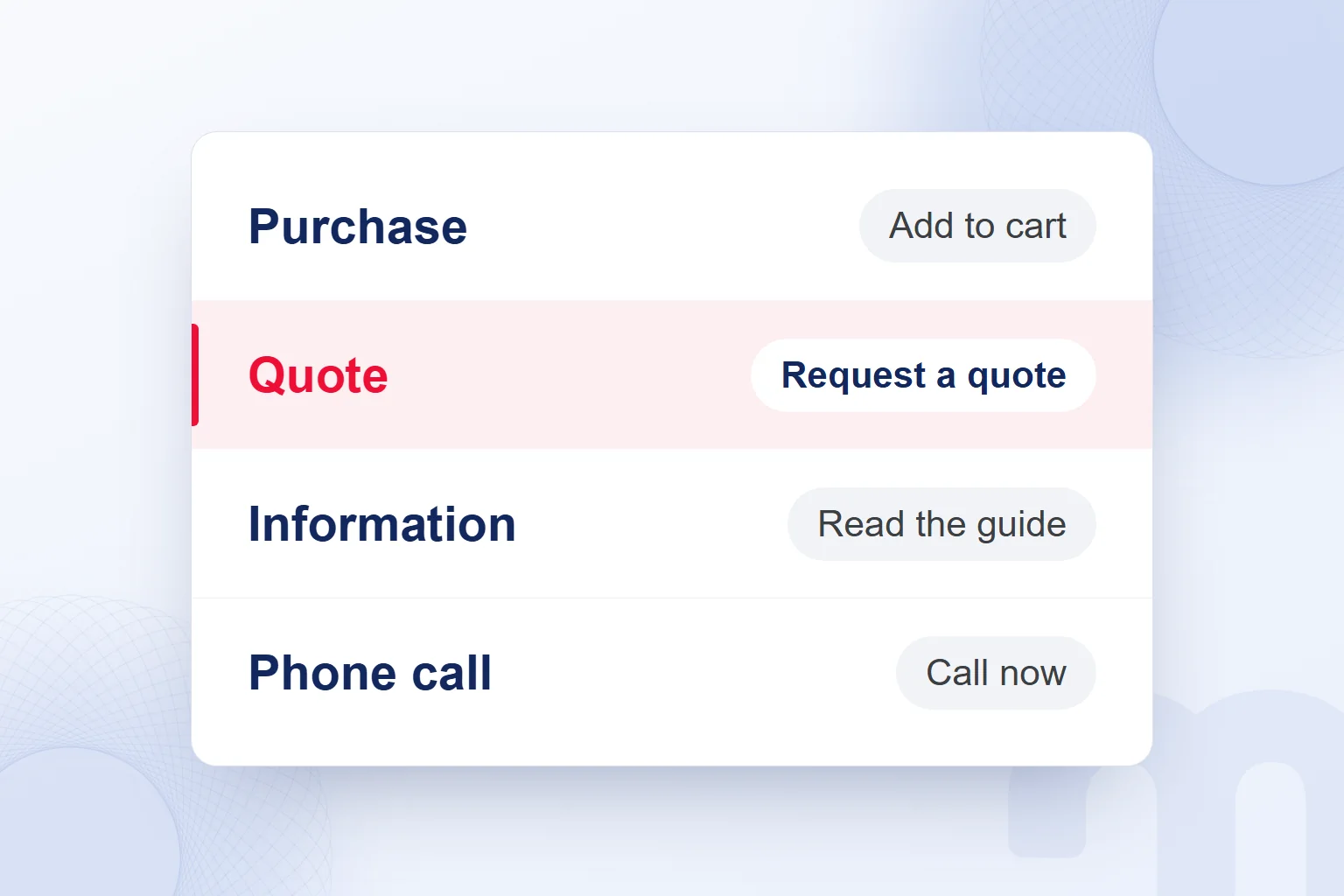
For a purchase we use “Add to cart,” for a quote “Request a quote,” for information “Read the guide” and for a phone call “Call now.” In each call to action example below, the text matches the action it starts.
| Goal | Call to action example | Next step |
|---|---|---|
| Purchase | Add to cart | The product is added to the cart |
| Quote | Request a quote | The quote form opens |
| Information | Read the guide | The guide page opens |
| Phone call | Call now | A phone call starts |
| Catalog download | Download the catalog | The catalog file opens |
| Information from an email | Read the care guide | The care guide page opens |
| Saving a post | Save this guide for when you need it | The reader saves the post |
| Sending people to site content | Open the link in our profile for the sizing guide | The reader reaches the guide through the profile link |
| A comment on the topic | Tell us which step was hardest | The reader names that step under the post |
| Sending viewers from a video description | Open the care guide in the description | The viewer reaches the guide through the description link |
On a stationery shop’s product page, “Add to cart” must actually add the product to the cart; we never give it to a link that only opens product details. When the action changes, the text changes with it.
For a curtain workshop, “Request a quote” must open the quote form. The fabric guide page uses “Read the guide,” and the area where we want a phone conversation uses “Call now.”
Between “Download the catalog” and “View the catalog,” the choice depends on whether a file opens or a page is displayed; the two are not interchangeable. The verb has to match the real action.
On social media, the call names the action the reader takes; it is not judged like web button text. We never use “Save this guide” as the name of a link that downloads a file. When adapting examples, we choose the place first, then the object and the verb.
How do you test a CTA?
We test a CTA by changing one variable and comparing the versions with the same measurement. We decide in advance which behavior we track. When comparing text, position and size stay the same; when testing position, the text stays; every change is recorded.
For a CTA that leads to a quote form, we track button clicks and form completions separately and confirm both are measured the same way in every version.
The first step is to separate the situation:
- The button gets clicks but the form is not completed → we examine the form and the step after the button.
- The button goes unnoticed → we check its position and size.
- Several main actions compete on the page → we choose one and turn the others into secondary links.
In CRO consulting work, we measure and test the CTA with the rest of the page, treating the text before the button, the destination page and the form as one flow.
For each new test, we keep the previous version’s text and measurement definition and record any other change made during the comparison. We never change every element at once and then credit the result to a single cause.
What are the most common CTA mistakes?
The most common CTA mistakes are text that does not name the action, a button promise the destination does not keep, and a selectable area that is too small. We check by reading the text, tapping the button and completing the step that opens.
The fix depends on the situation:
- The button says “Click here” → we write text that says what happens on click.
- The page that opens does not keep the button’s promise → we correct the text or the destination page.
- The button is too small on a touchscreen → we bring the target up to at least 24 by 24 CSS pixels.
When fixing “Click here,” we use the name of the action at the destination: price list if a price list opens, request a quote if a quote form opens. We also reread the surrounding text so the old promise does not linger there.
After the fix, we follow the same path again: the text is understood, the button can be selected, the promised content opens.
We cover message calls such as a WhatsApp button in What is WhatsApp Business? and the call inside an offer layer that opens over the page in What is a pop-up?. For more on CTAs, copywriting and landing pages, see our blog.
Frequently asked questions
What is a call to action?
A call to action is a short message that tells visitors what we want them to do on a page and how. It usually appears as button or link text.
What does CTA stand for?
CTA stands for “call to action”: a short message that tells people which step to take next and how.
What makes good CTA text?
Good CTA text starts with a verb, says what will happen and supports the page’s one main action. We compare the action in the text with the action the button starts.
How big should a CTA button be?
Under WCAG 2.2 success criterion 2.5.8, a pointer target must be at least 24 by 24 CSS pixels. Exceptions are spacing, equivalent, inline, user agent control and essential.
Why is “Click here” not a good CTA?
On its own, “Click here” does not say what the click is for. Text such as “Read the guide” names the action and the content the reader will reach.
How do you test a CTA?
We change one variable and compare the versions with the same measurement, tracking button clicks and the follow-up action separately.
How do you write a CTA on Instagram?
We ask for one action in the first line of the caption: saving the post, opening the profile link or commenting on the topic. Any brand partnership is disclosed separately.
Can you change the CTA button in an ad?
In Meta ads, the CTA button is chosen from a fixed list; its text cannot be written freely. Options vary with objective and placement, so the detail goes into the ad copy.

 What is a tweet, what does retweet mean? Posts and reposts on XRead article
 What is copywriting? What a copywriter does and how to write ad copyRead article
 What is network marketing? How it differs from pyramid schemesRead article
 What is a buyer persona? How to create one, with a templateRead article
 What is Affiliate Marketing? Commission Models and Building a ProgramRead article
 What is WhatsApp Business? Free app, Platform (API) and how to use itRead article
 What is a podcast? How podcasts work for brands and where to publishRead article
 Best time to post on TikTok: finding it with your own account dataRead article
Questions & answers
0 commentsNo questions yet; you can ask the first one.