





 Cihat Murat Yüksel
17 min read
Contents 18 sections
Key takeaways
- Pantone is the name of a color numbering system and of the company that developed it.
- WCAG 2.2 level AA requires contrast of at least 4.5:1 for normal text and 3:1 for large text.
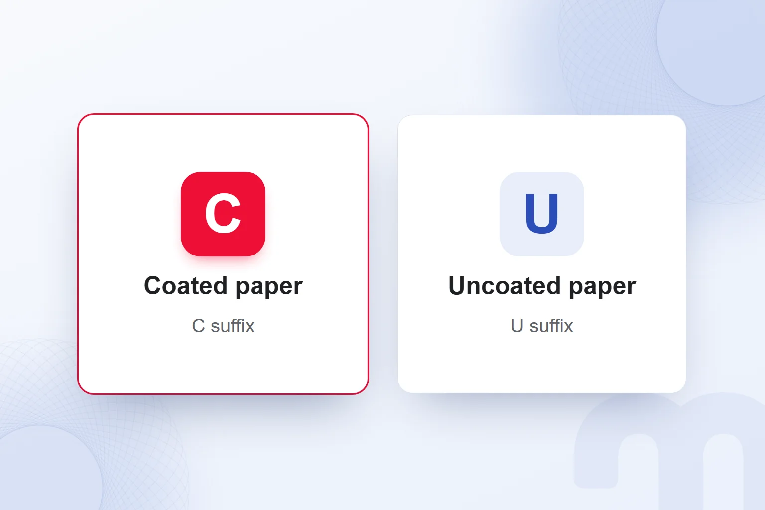
- In a Pantone number, C indicates coated paper and U indicates uncoated paper.
- Spot colors use premixed ink, while CMYK builds images from four base inks with dot screens.
Pantone is the name of a system that identifies colors by number and of the company that developed it. As a shared reference for printed with premixed ink, it helps reproduce the same color.
At markention we choose colors by the jobs a palette must do: primary color, supporting colors and neutrals. We keep each color’s print and screen records on one card and check text/background contrast. A palette is complete not when colors look good together, but when we know where each is used and with which code.
A brand color is recorded with four values and compared against a printed sample before printing.
What does Pantone mean?
Pantone is the name of a color system that identifies colors by name or number, and of the company behind it. The PANTONE MATCHING SYSTEM used in print, PMS for short, gives a shared definition for matching specific colors very closely. Each spot color has its own name or number.
In Pantone’s “Spot vs. Process Color” explanation, PMS colors produced without or dots are called spot or solid colors. Premixed ink goes directly onto the paper. In a corporate identity, the record carries the Pantone number with its paper suffix.
Spot colors are common in jobs needing a few exact colors, in corporate logos and in identity work. Used in one-, two- or three-color jobs, the method defines a color by its ink mix. On a color card we reserve the Pantone field for this print reference.
What is a Pantone color guide?
A Pantone color guide is a printed swatch book for browsing colors by name or number. The PANTONE FORMULA GUIDE holds the formulas for mixing each spot color from base inks. A printer can mix the color from the formula or order it by number.
We read the color number and the C/U suffix together. A swatch on screen never replaces a printed comparison on the actual paper. A record chosen from the catalog is stored with the paper the job will use.
What is the Pantone Color of the Year?
The Pantone Color of the Year is the color Pantone announces each year. In a brand palette we treat it as one item to review; the primary color’s job, supporting colors and conditions of use are assessed separately.
Liking an announced color is no reason on its own to change a color card. Every palette color faces the same questions: Where is it used, what is it paired with, and if used for text, is the contrast sufficient?
How do you read a Pantone color code?
A Pantone color code is read as the color’s number or name plus the C or U paper suffix after it. C stands for “coated” paper, U for “uncoated” paper. The final letter states which paper the record is for.
According to Pantone, a printer can order the color by number or mix it with the formula in the PANTONE FORMULA GUIDE. The formula defines how that spot color is mixed from base inks. Both routes rest on the same color definition.
On the color card we keep C and U records separate. When copying a number we keep its suffix and never split paper information from the color definition. Before printing we look first at the paper, then at the Pantone definition recorded for it; a matching number alone is never enough.
What is the difference between spot color and CMYK?
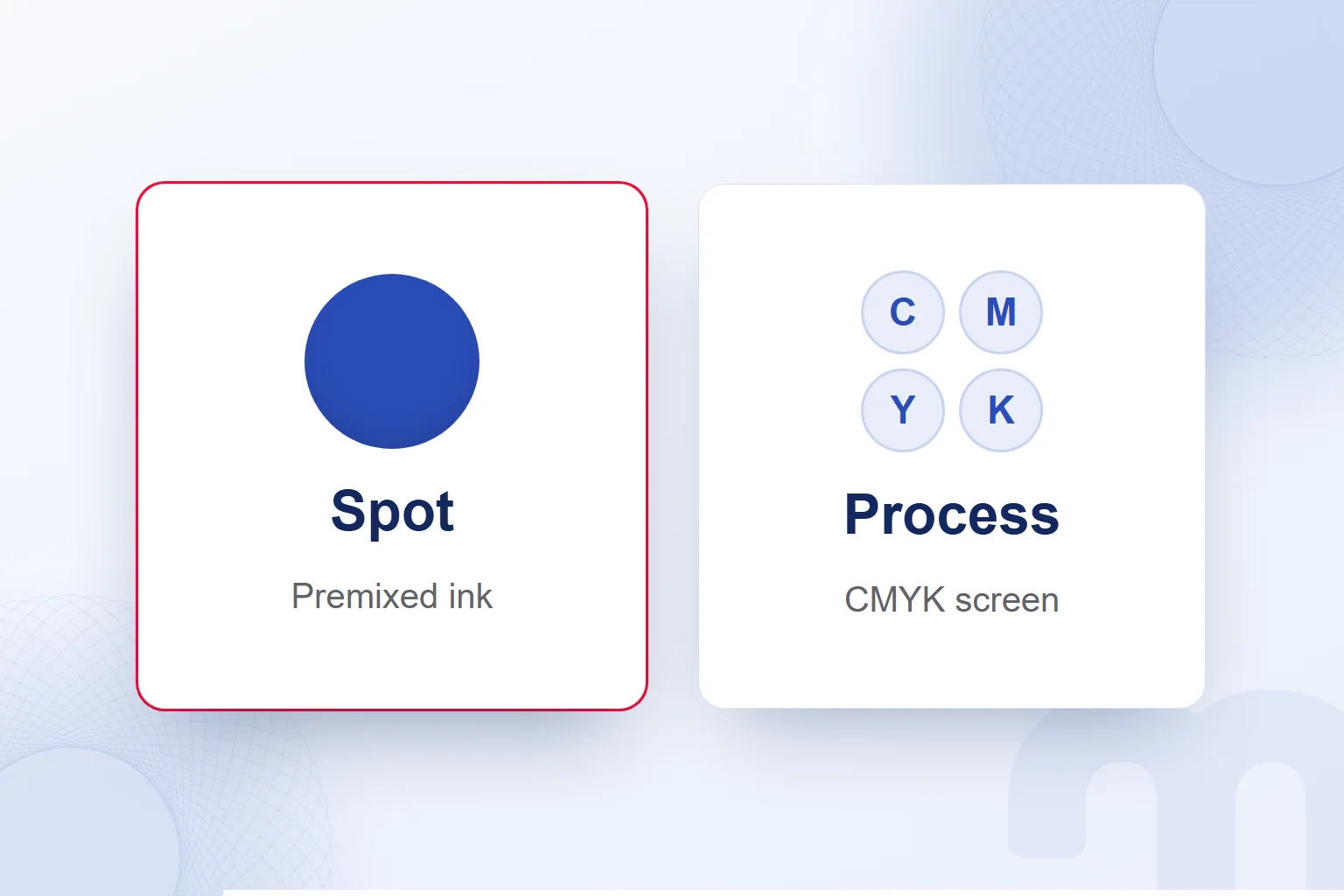
A spot color is printed directly with premixed ink; CMYK separates the image into four base inks and builds it with dot screens. Pantone’s distinction is how color reaches the paper: premixed ink without screening in spot printing, standard inks through very fine screens in process printing.
Process printing generally produces thousands of colors with four or more standard inks. The most common method is CMYK: Cyan, Magenta, Yellow and Black. A color image is separated into these four; in each separation small dots form screens at different angles.
PMS spot colors are mixed from Pantone’s palette of 18 base colors with their own formulas. Thanks to this range, some spot colors are cleaner and brighter than four-color process. That is not an advantage for every color.
Photos, illustrations and complex color images belong to process printing. In Pantone’s company brochure example, photos print in process and the logo in a spot color, so both methods share one brochure. We assess the photo and the logo separately and prepare color records to match.
What are RGB and HEX codes?
RGB defines an on-screen color by its red, green and blue components; HEX writes those components in hexadecimal digits. In the W3C’s CSS color definition, the first pair of a six-digit HEX code gives red, the second green and the last blue.
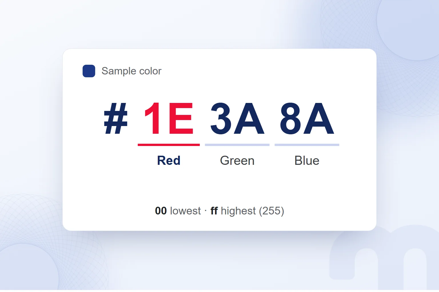
In the sample code “#1E3A8A”, red is “1E”, green “3A” and blue “8A”; it is not any brand’s color. In HEX, “00” is the lowest value and “ff” the highest, equal to 255 in decimal.
Three-digit HEX expands by writing each digit twice: “#123” equals “#112233”. In the eight-digit form, the last pair is the alpha (transparency) value: “00” fully transparent, “ff” fully opaque.
In rgb(), the first three values are red, green and blue. Components are 0–255 values or percentages; 100% equals 255. According to the W3C, colors in HTML and untagged images are assumed to be unless stated otherwise.
For an on-screen user interface we use the card’s RGB and HEX records. We fix screen color values in interface design within our UX/UI design service. We check that both notations belong to the same record and take the format the application needs.
How do you find a HEX code, and Pantone from HEX?
We take the HEX code from the existing color card; if we only have an image, we extract the picked color and record it. Adobe’s color tools can extract a palette from an image. We first decide which color we are picking, then place the record in the right palette row.
Pantone Connect isolates a color in a digital file and finds the closest Pantone match. It also finds the closest RGB, CMYK, HEX and L*a*b* equivalents of Pantone colors and converts in reverse. For physical measurement, the Color Match Card works with the mobile app.
The decisive phrase is closest match. A Pantone found from HEX is never read as a guaranteed identical result, and the same limit applies from Pantone to screen codes. We never assign CMYK or HEX equivalents by eye; we take them from Pantone’s own guides.
With only a logo image, we first extract the chosen color’s screen record. If print is needed, we find the closest Pantone match and assess the C/U record with the paper. Finding the code is not the end: before printing, it is compared with a printed sample.
What is the difference between Pantone, CMYK, RGB and HEX?
Pantone defines the spot print color, CMYK the ink proportions of process printing, RGB a screen color’s components and HEX their hexadecimal notation. Whether the job appears in print or on screen decides which record is used.
| Format | Where it is used | How it is written |
|---|---|---|
| Pantone | Spot color printing, logos and corporate identity | Number with a C or U suffix |
| CMYK | Photographic and multicolor process printing | Cyan, magenta, yellow, black proportions |
| RGB | Screen | Red, green, blue values (0–255) |
| HEX | Web and screen | # and six hexadecimal digits |
Four fields on a card do not mean all four apply to every job. A screen design uses RGB or HEX; print uses the Pantone or CMYK record suited to the method. In the Pantone row, number and paper suffix stay together.
RGB and HEX are two notations of one screen color; Pantone and CMYK describe printing. So we answer “What is a color code?” together with the medium. Whoever takes over a design must see which record belongs to which medium, not just the color.
What is a color palette?
A color palette is a limited set of colors used together in a design. In brand work we organize it into a primary color, supporting colors and neutrals. This makes each color’s job visible; a palette file holds usage notes, not just swatches.
The primary color is the brand’s core color record; we also define when it stands out. Supporting colors create the distinctions needed beside it. For neutrals we set jobs such as text and background and check which pairings are readable.
On a typical web page the primary color might go to the selected element, a supporting color to another content group, and neutrals to text and background. This is one example, not a fixed recipe. The number and distribution of colors follow the design’s needs.
Palette notes state the job, not “this color looks nice,” and assess each use of a color separately. The color card stores codes; the palette notes explain how they are shared across the design.
How do you choose and build a color palette?
We build a color palette by setting a base color, choosing a harmony type, adding neutrals and checking conditions of use. In Adobe’s color wheel approach, the start can be a base color, colors extracted from an image, or the wheel itself. We then complete the palette with usage jobs.
- Choose the base colorWe set the primary color and note where it is used; starting from an image, we clearly mark the picked color.
- Choose the harmony typeWe assess the Adobe color wheel’s harmony options and pick supporting colors for the primary color.
- Add neutralsWe add text and background colors to the palette and record each one’s job.
- Record each color with four codesWe collect Pantone C/U, CMYK, RGB and HEX on one card, using verified equivalents.
- Check contrastWe check text/background pairs against at least 4.5:1 for normal text and 3:1 for large text.
- Test in print and on screenWe review the screen version and compare the paper and printed sample with the record.
The result is more than strips side by side: each color’s role and its text/background pairings are on record. Whoever takes over the palette sees these jobs and equivalents together.
How do you find colors that go together?
To find harmonious colors we start from the complementary, analogous, triad, monochromatic and split complementary options on the Adobe color wheel. In a complementary harmony, the tool picks the hue opposite the base color. We compare the other options against the same base color.
Each option gets its own working question. With complementary we decide which element gets the opposite hue; with analogous, where supporting colors go. With triad we write each candidate’s job separately. Monochromatic suits a palette built around the primary color; split complementary lets us explore an alternative harmony.
Naming the option is not enough. For each candidate we place text, background and the selected element in one sample design. If we cannot explain which color does which job, we reorganize the jobs. Harmony is assessed together with contrast.
Liking colors together does not prove every pair works, so every candidate faces one question: Can the color do the job we gave it? The answer comes from the design and the contrast check, not the color’s name.
Tools for finding a color palette
Adobe Color and the Adobe Express color wheel help find a palette from a base color or an image. The choice depends on our starting material: with a defined primary color we use the wheel; with an image, color extraction.
Colors extracted from an image are not brand records right away. We first decide which will be primary, supporting or neutral. Rather than carrying every color into the design, we build a limited set covering the jobs we need. This is our own way of organizing a palette.
Adobe’s color wheel offers color blindness previews and a contrast check; we review candidates with both. The color wheel does not use generative AI, so we do not call a choice made with it AI-generated.
We recommend tools only by need: Adobe for palettes and harmony, Pantone Connect for color matching. We judge the output by whether it completes the color jobs, code records and checks our work requires.
How do you define brand colors?
We define brand colors by choosing a primary color, a supporting color and neutrals, and recording each one’s job, codes and text/background pairings. First we write where the color will appear: logo, screen interface or print. Usage rules form along with the choice.
Logo colors are recorded on the same card; the logo’s role in an identity is covered in our what is a logo article. We never separate color choice from print and screen use. Each color has Pantone C/U, CMYK, RGB and HEX fields; text/background pairs are checked against 4.5:1 for normal text.
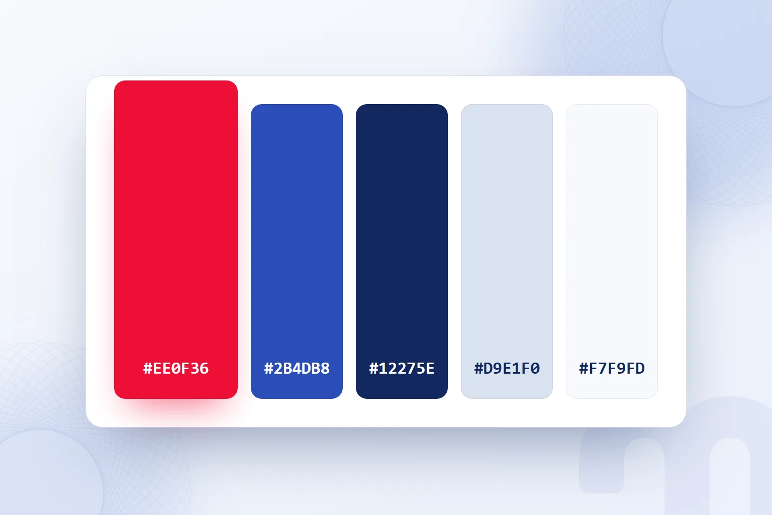
Our first-hand example is the markention palette: red #EE0F36, cobalt #2B4DB8, ink #12275E and light background #F7F9FD. We use red only on the selected or winning element. The rule sets when the color stands out; it does not mean painting every heading or card red.
In a comparison, for example, we mark the winner in red and check that other items lack the same accent. This is our own palette’s rule. We do not attach universal emotional meanings to colors; we rely on the assigned job and the result in use.
When a palette goes into use, the fix depends on the problem:
- The brand color is too light to read as text → we measure the text/background contrast, pick a suitable palette color for text and recheck.
- It prints differently → we check the Pantone C/U record against the paper and compare with the relevant printed sample.
- Teams use different codes → we gather approved values on one color card and state which field is for print and which for screen.
In none of these cases do we change the primary color right away. We first check whether the problem lies in the usage job, the print record or a difference between files. The fix goes into the palette’s usage notes, so the next design need not reinterpret it.
How do you check color contrast?
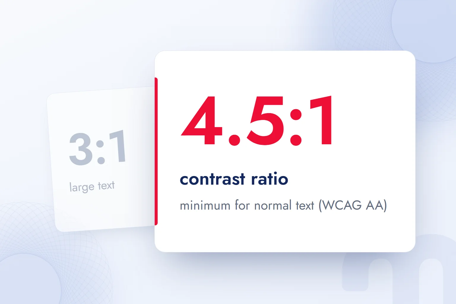
We check color contrast by measuring text and background colors together and comparing the ratio with the threshold for that text size. W3C WCAG 2.2 Success Criterion 1.4.3 requires at least 4.5:1 for normal text and 3:1 for large text at level AA.
Here large text means at least 18 point, or 14 point bold. Calling a heading “large” is not enough; its size must meet this condition. Once the text’s class is set, we use the matching threshold.
Contrast ratios are not rounded: 4.499:1 does not meet 4.5:1. We never round a borderline result up to a pass. We compare the tool’s result directly with the threshold and rework the pairing if it falls short. The check record keeps text and background colors together.
In Adobe’s contrast check we review the text/background pair chosen from the palette. If the same text color sits on another background, that pair is checked too. One passing pair does not mean all pairs pass.
Say on a typical page the light brand color is chosen for long text and fails the check. We move the text job to another palette color and measure the new pair. We also note which job the first color keeps, so the decision stays visible.
We also preview candidate palettes for color blindness and record that and the contrast ratio as separate results. When text size or background changes, we check the new pairing instead of relying on the old result. These ratios describe the AA conditions for text contrast.
How do you keep a brand color consistent in print and on screen?
We keep a brand color consistent by recording separate print and screen values and comparing with a printed sample before printing. One color card is the reference for both media. We read its values with the job’s medium and printing method.
The situation is usually one of these:
- A single-color logo in a corporate identity → we set the Pantone number and paper suffix for the spot color.
- A multicolor brochure with photos → we print photos in CMYK process and add the logo in a spot color if needed.
- The color appears only on screen → we use the HEX or RGB value.
When one design yields a brochure and a screen graphic, each one’s color records are checked separately. For the brochure we state which part prints in process and which in spot color; the screen file uses the RGB or HEX record. A color name alone does not explain these production decisions.
Screen and print differ. We assess the printed sample against the card’s print record: the paper suffix in a Pantone job, the CMYK value in process printing. Liking the screen version does not replace the printed sample comparison.
On a difference, we check the record first. Was the right Pantone suffix used, was the recorded CMYK value used for process printing, does the screen file carry the correct RGB/HEX value? Only then do we assess the printed sample, so a file handoff gap is not mistaken for a media difference.
How do you record a brand color?
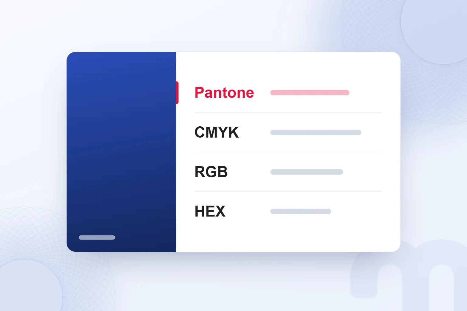
We record a brand color by bringing its Pantone, CMYK, RGB and HEX values together on one color card. In the Pantone field, C and U records stay separate. For several colors, we repeat the layout for each.
- We choose the primary colorWe set the brand’s primary color and gather its print and screen values.
- We write the Pantone number with C and UWe keep separate records for coated and uncoated paper, each number with its own suffix.
- We record the CMYK valueWe add cyan, magenta, yellow and black proportions to the process printing record.
- We record the RGB and HEX valuesFor screen, we put the red, green and blue components and their HEX notation in separate fields.
- We gather the values on one color cardWe keep Pantone, CMYK, RGB and HEX together and use the relevant field in print and screen work.
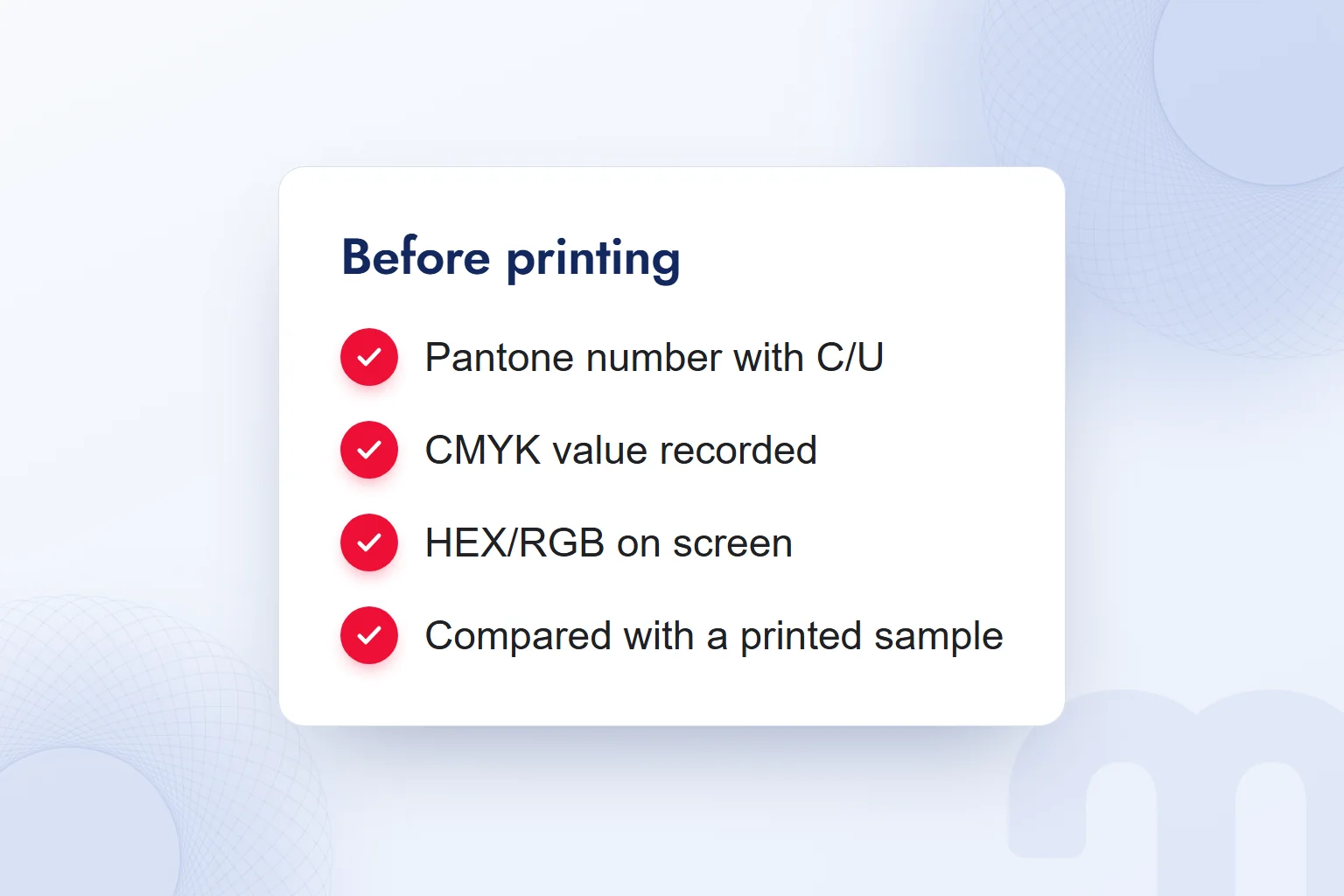
- We compare with a printed sampleBefore printing we assess the printed sample, accounting for the screen–print difference.
Next to the codes we add the palette job. Seeing “Primary color” and “used on the selected element” together, whoever takes over the design learns both value and usage decision. For text colors we also record which background the contrast check used.
If a handoff contains only five color strips, it is unclear which color goes where. Once jobs, four code fields and the checked text/background pairs are added, the record becomes usable. We never fill an unverified print field with an estimate; we complete it from the Pantone guide.
What are the most common mistakes with color codes?
The most common mistakes with color codes are dropping a Pantone number’s paper suffix, treating screen appearance as identical to print, and scattering color values across files. In the final check we assess the color card, the usage notes and the printed sample together.
The table collects frequent situations and how we handle each.
| Situation | What we do |
|---|---|
| A Pantone number was given without C or U | We check the right record and suffix for the paper. |
| The on-screen color was assumed to print the same | We compare it with a printed sample. |
| Color values are scattered across files | We gather them on a single color card. |
| The palette is only color strips | We add primary, supporting and neutral jobs. |
| A text color was assumed to pass without measuring | We check the text/background pair against the relevant contrast threshold. |
| A Pantone found from HEX was taken as an exact match | We treat it as the closest match and compare it with a printed sample. |
We read each value with its own area of use. A wrongly copied field differs from a missing record: for the first we return to the right field, for the second we complete it from its source. When files disagree, the approved card wins.
Image dimensions for screen are covered in our Instagram post size article, and our other guides on color and interface design in our digital marketing articles. Before handing over a design, we check that color jobs, the codes chosen for each medium and contrast results read together.
This term is part of our digital marketing glossary. You can reach the one-sentence definitions of the other terms there.
Frequently asked questions
What does Pantone mean?
Pantone is a color system that identifies colors by number, and the company behind it. It gives a shared reference for reproducing the same color in print with premixed ink.
How do you read a Pantone color code?
A Pantone code is read as the color number or name plus a paper suffix. C indicates coated and U uncoated paper.
What is CMYK?
CMYK is four-color process printing with cyan, magenta, yellow and black inks. The image is separated into these colors and printed with dot screens at different angles.
What is RGB?
RGB defines a color by its red, green and blue components. For screens, these are written as 0–255 values or percentages.
What is a HEX code?
A HEX code shows a color’s red, green and blue components in hexadecimal digits. In the six-digit form, the pairs after # give these components in order.
What is the difference between Pantone and CMYK?
A Pantone spot color is printed directly with premixed ink. CMYK builds the image from four base inks applied through dot screens.
How do you create a color palette?
We choose a base color and harmony type, then supporting colors and neutrals. We record each color with Pantone C/U, CMYK, RGB and HEX, check contrast and test in print and on screen.
How do you choose brand colors?
We choose the primary color, supporting color and neutrals with their jobs. We check text/background contrast, gather codes on one card and compare with a printed sample before printing.

 How to make a presentation: AI tools, PowerPoint and proposal decksRead article
 How to make money on Instagram: eligibility requirements and toolsRead article
 What is a slogan? How to write one, and how it differs from a taglineRead article
 What is a SWOT analysis? How to do one, and how it differs from PESTRead article
 What is a case study? How to write a client case study, with templateRead article
 What is a blog, and what is a blogger? How to write a blog postRead article
 Instagram post size: square, portrait, story and Reels dimensionsRead articleMost read
 What is a hashtag? How to use hashtags and how many to addRead article
Questions & answers
0 commentsNo questions yet; you can ask the first one.